Friday, September 24, 2010

Explosions of colour: Walasse Ting

The painter and lithographer Walasse Ting, who died earlier this year, occupies a unique place in the dialogue between American and European art in the 1960s. Ting was an outsider to both cultures. He was born Ding Xiongquan in Shanghai in 1929. After studying briefly at the Shanghai Art Academy, he left China in 1946, living initially in Hong Kong before sailing to France in 1950. In Paris, Walasse Ting came under the influence of the artists who made up the avant-garde group CoBrA, most notably Pierre Alechinsky, Karel Appel, and Asger Jorn. In 1958, Ting moved to America, where his closest associate was the Abstract Expressionist painter Sam Francis. In 1964, Walasse Ting and Sam Francis collaborated on one of the greatest artist’s books of the period, a collection of Ting’s stream-of-consciousness Pop Art poems illustrated with original lithographs by a total of 28 artists, entitled One Cent Life. Unfortunately I don’t have a copy of this, but it’s a remarkable work, and particularly notable for the way in which it mixes the slick Pop Art of Americans such as Andy Warhol with the turbulent work of the CoBrA artists. Whereas in the USA Pop Art concerned itself largely with surfaces, as a comment on consumerism, in Europe it concerned itself with structures, as a critique of consumerism. A typical CoBrA work is a violent, semi-abstract, distorted, highly-sophisticated version of a child’s drawing. There are echoes of folk art and tribal art, and a sense of rejection of society’s falsely-imposed sense of order and respectability. Walasse Ting could straddle both these worlds, and it is largely due to his One Cent Life that one can even speak of a single Pop Art movement, embracing both the Americans and the Europeans. 

Pierre Alechinsky. Hommage à Aimé et Marguerite Maeght
Lithograph, 1982

Sam Francis, Noise
Lithograph, 1989

Like his friends Sam Francis and Joan Mitchell, Walasse Ting was very open to European ideas, and it is these three above all who incorporated into American Abstract Expressionism the aesthetics of the gestural semi-abstract European style known as Art Informel (which, in turn, was profoundly influenced by de Kooning and Pollock). From the mid-1970s Wallace Ting’s art became much more figurative and decorative, concentrating on brightly-coloured images of naked women, flowers, birds, horses, and other animals, in a vivid dreamscape of sensual pleasure. These works, painted in acrylics with a Chinese brush on rice paper, have a great deal of charm and vivacity (you can see a selection here), but I prefer his more challenging earlier work. Wallace Ting’s lithographs of the 1960s simply explode onto the page in an orgasmic riot of colour. There’s a rawness and immediacy to his work of this period that really appeals to me.

Walasse Ting, Untitled composition 1
Lithograph, 1963

Walasse Ting, Untitled composition 3
Lithograph, 1963

Walasse Ting, Untitled composition 6
Lithograph, 1963

Walasse Ting, Untitled composition 9
Lithograph, 1963

My first Walasse Ting lithographs are all untitled compositions from the catalogue to his 1963 exhibition at the Galerie Birch in Copenhagen. The lithographs were printed by Permild and Rosengreen.

Wallace Ting, Butterfly gun
Lithograph, 1967

Walasse Ting, Iris bursting
Lithograph, 1967

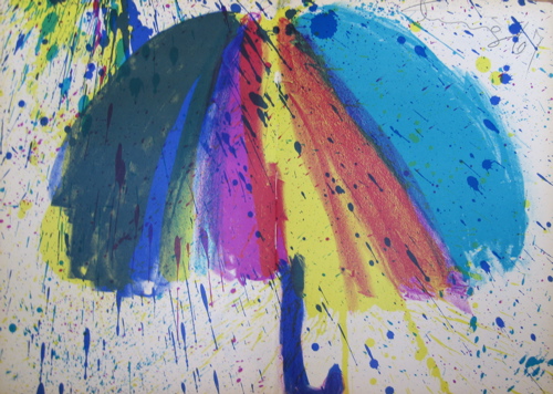
Walasse Ting, Singing in the rain
Lithograph, 1967

Walasse Ting, Twinkling star
Lithograph, 1967

My next group of lithographs, also printed by Permild and Rosengreen, were made in 1967 for Walasse Ting’s collection of classical Chinese poetry, in his own translations, Chinese Moonlight. The lithographs were bound into the book, so have a central vertical fold and minute thread holes; on the plus side, all four of mine are boldly signed in pencil Ting ’67; the book is additionally inscribed by Ting to John Schiff.

Walasse Ting, Someone make love
Lithograph, 1969

Walasse Ting, Love is many splendored thing
Lithograph, 1969

Walasse Ting, Male order
Lithograph, 1969


Walasse Ting, Chicken chow mein
Lithograph, 1969

Walasse Ting, Rainbow as thread
Lithograph, 1969

Walasse Ting, Dedicated to all prostitutes in the world
Lithograph, 1969

My final Walasse Ting lithographs, printed by Bjørn Rosengreen and published by the Sam Francis Foundation, come from his poetry collection Hot & Sour Soup. My copy of this was inscribed by Ting to the influential art critic of the New York Times, “To John Canaday, Sunshine as best wishes, moonlight as desert, from Walasse Ting 22 October 1969 NYC”.

Walasse Ting, Dragonflies mating
Ink drawing, 1969

And last of all I have a single Walasse Ting ink drawing, boldly drawn on a blank page of Hot & Sour Soup for John Canaday.

Walasse Ting, 1929-2010
Photographed in 1963

In his later years Wallace Ting lived in Amsterdam, making frequent trips to both New York and Tahiti. He ceased painting in 2002 after suffering a severe stroke, and died in New York on May 17, 2010.

Thursday, September 2, 2010

A master of engraving: Albert Decaris

Copper plates were, until about 1820, the only metal on which intaglio prints, either engravings or etchings, were made. As Bamber Gascoigne explains in his excellent book How to Identify Prints, steel plates were first used in the 1820s "to print long runs of banknotes which would remain identical throughout the run and which would be so finely engraved as to make forgery difficult." The harder metal was more difficult to work with, but enabled very fine detailing, and the plates never wore out. Steel plates became popular for various kinds of subjects, notably topographical views, which might be printed in large numbers to appeal to tourists. From the 1850s it was possible for artists to work on the more forgiving copper plates, which were then subsequently "steel-faced", a process in which a thin layer of iron is electro-plated to the surface of the copper, thereby extending the life of the plate. Steel plates remained the choice for banknotes and postage stamps, copper for fine art. But one important twentieth-century engraver, Albert Decaris (1901-1988), made engraving on steel his life's work. Decaris seems to have valued steel for the immaculate clarity of line that can be achieved, and for the shimmering effect that such lines produce when engraved in parallel. Albert Decaris engraved over 500 postage stamps for the French and French colonial postal services, and also illustrated a large number of books. I have 3 sets of prints by Decaris, showing different aspects of his art. All exhibit an astonishing technical virtuosity, but they can feel a bit stark. For that reason my favourites are his engravings of Paris, which are not just detailed and evocative but full of warm feeling for the city he loved.

Albert Decaris, Île de la Cité
Engraving, 1950

Albert Decaris, Feux d'artifice sur la rive droite
Engraving, 1950

Albert Decaris, Feux d'artifice sur la rive gauche
Engraving, 1950

Albert Decaris, Montmartre et le Sacré Coeur
Engraving, 1950

Albert Decaris, Rue Drevet à Montmartre
Engraving, 1950

Albert Decaris, Rue Broca
Engraving, 1950

Decaris's studio was on the left bank of the Seine, with a view over the river and the Louvre. The wood engraver Mark Severin visited him there in 1950, and wrote in his essay "Decaris, engraver" in The Studio, "One's first impression on a visit to the studio of Decaris is of constellations of little white metal splinters scintillating like stars on the dark floor, which has suffered from the continuous shower, and then of the window opening on the Seine and the Louvre."

Albert Decaris, Notre-Dame et la rive gauche
Engraving, 1950

Albert Decaris, La rive droite et le Louvre
Engraving, 1950

These magnificent views of Paris were made for the book Paris by André Suarès. This was published in 1950 in an edition of 250 copies, all printed on Montval laid paper. Additionally there were 50 separate suites of the engravings printed on Auvergne paper, and 25 albums of the engravings. My images show the engravings as they appear on the handmade Auvergne paper of one of the 50 suites. The engravings were printed by Georges Visat.

Albert Decaris, Florence
Engraving, 1930

Albert Decaris, Pisa
Engraving, 1930

Albert Decaris, Street in Siena
Engraving, 1930

Paris was not the only city to play an important role in the life of Albert Decaris, for in 1919 at the age of just 18 he won the prestigious Grand Prix de Rome for engraving, which entitled the winners to an extended period in the Villa Medici in Rome to further their studies. Decaris's time in Rome, though interrupted by illness and then by military service, was crucially important to him, and Italian subjects seem to have appealed strongly to him. This made the commission to illustrate the travel book Du Sang, de la Volupté, et de la Mort by Maurice Barrès, which is set largely in Italy and Spain, a perfect choice for Decaris. This was published in 1930 in an edition of 316 copies, with 85 separate suites of the engravings printed on B.F.K. Rives by Edmond Rigal; again, my photos show one of the suites.

Albert Decaris, Women of Seville
Engraving, 1930

Albert Decaris, Bullfight
Engraving, 1930

Albert Decaris, Spanish fiesta
Engraving, 1930

As can be seen from the illustrations above, after Albert Decaris had formed his mature style it did not alter or develop much. 20 years separate the two series of prints, but you would never guess it. My third set of prints comes from 1967, when Decaris illustrated a monumental edition of Plutarch's Lives. I don't have this 3-volume work, but instead a publisher's sample, with 21 of the 58 full-page engravings, which were printed by Serge Beaune on Marais wove paper. This publication really took advantage of the hard-wearing quality of steel plates, being issued in an edition of 3600 copies (of which I believe 100 were on Antique Bellegarde paper, with a double suite of 8 "planches refusées"). Because I don't have the text, I am left in a few cases guessing precisely what subject is depicted in the images. These vigorous engravings show no slackening of skill, but lack, for me, the personal element that gives the depictions of Paris their particular charm.

Albert Decaris, Theseus and the Minotaur
Engraving, 1967

Albert Decaris, Cleopatra
Engraving, 1967

Albert Decaris, Caractacus in chains(?)
Engraving, 1967

Albert Decaris, The ruins of Athens (?)
(Any ideas as to who this solitary brooding figure is?)
Engraving, 1967

Albert Decaris was born in Sotteville-les-Rouen in the Seine-Maritime, and died in Paris. Although he was highly respected as an artist and achieved various high honours - elected to the Institut in 1943, named an official "peintre de la Marine" in 1973 - his decision to concentrate on commissioned work such as book illustrations and postage stamps meant that his art has not received the attention you would expect for the youngest person ever to win the Grand Prix de Rome, and the first person ever to win the Medaille d'Argent at the Paris salon with his first exhibit. His art may be severe, but it is also meticulously observed, and rendered with extraordinary skill. I'll leave the last words to Mark Severin, who wrote, "The refinement as much as the sublimity of his art, which is essentially typically French, makes him one of the great masters of engraving."