Thursday, March 29, 2012

The rise and fall of the Expressionist woodcut

The woodcut is the archetypal Expressionist medium - vital, energetic, powerful. One thinks of artists such as Erich Heckel, Frans Masereel, Emil Nolde, Max Beckman.

Certainly since the 1870s and the rise of Impressionism, art movements have come and gone with incredible speed. It is interesting to see how quickly the Jugendstil (German art nouveau) colour woodcuts, that make such an interesting western comment on the Japanese woodcut tradition, become overwhelmed by the new Expressionist mode - a jagged, rough-edged, almost brutal aesthetic, which nevertheless proves able to accommodate motifs as traditional as deer grazing in a landscape. All of the images in this post are taken from issues of the Viennese art revue Die Graphischen Künste. The first comes from 1910, and is I think an exceptional example of a Jugendstil woodcut. It's an incredibly strong yet subtle image, and for once I think my photograph does it justice.

Heine Rath (German, 1873-1920), Eisblumen
Woodcut, 1910

Leap across the First World War, and what do we find? A completely new world. The images are black-and-white, stark and uncompromising. Some of the artists are politically engaged, some are not, but in every case there is a rejection of decorative appeal in favour of graphic strength. I won't try to comment on each one, but simply let the images roll. It's interesting to see how the same aesthetic can be applied to the cityscape, landscape, animals, people, with such powerful results. But just as this movement took its momentum from the continental fracture of the Great War, it received its death blow from the rise of the Nazis. Faced with such horrendous ideas and actions - and the suppression of dissident artists - Expressionism had neither the vocabulary nor the means to survive.

Erwin Lang (Austrian, 1886-1962)
Turm von St. Stephan in Wien
Woodcut, 1932

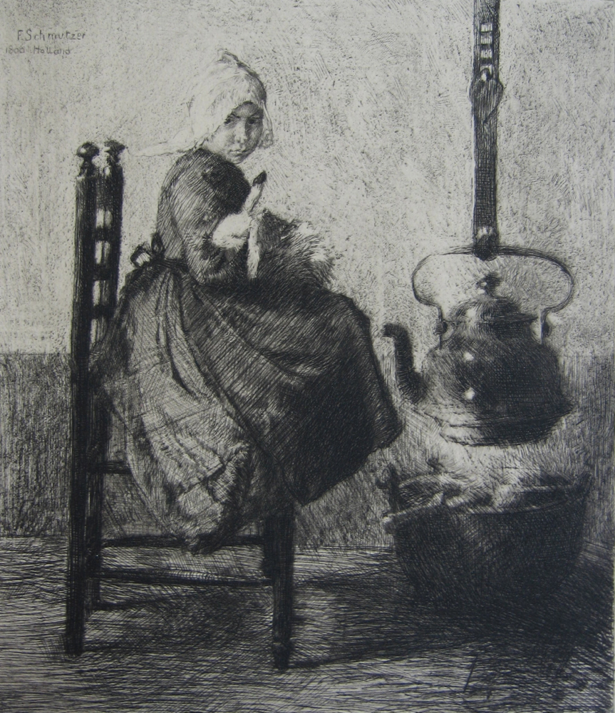
Emma Bormann (1887-1974)
Aus Hollande (Godlinze)
Woodcut, 1922

Adolf Weber-Scheld (German, 1892-?)
Rehe
Woodcut, 1931

Ernst Hrabal (Czech, 1886-1969)
Pietà
Woodcut, 1925

Elfriede Miller-Hauenfels (Austrian, 1893-1962)
Christus auf dem Ölberg
Woodcut, 1922

I am particularly interested in the religious connotations in the two cuts above, and the one below. In a way one thinks of Expressionism as a post-religious movement of the Machine Age. But the woodcut by Hrabal shows how even the landscape could evoke religious feeling, while that of Miller-Hauenfels reimagines the torment of Christ on the Mount of Olives in twentieth-century terms. As for what is happening in the image below by Walter Clemens Schmidt - who knows?

Walter Clemens Schmidt (German, 1890-1979)
Glückschiff
Woodcut, 1925

Robert Philippi (Austrian, 1877-1959)
Törichte Jungfrau
Woodcut, 1930

Robert Philippi, the creator of this foolish virgin, taught Egon Schiele wood engraving and etching.


Jan Rambousek (Czech, 1896-1976)
Karrenzieher
Woodcut, 1933

Note the billboard advert for the Prague football club FK Viktoria in the background.

Karl Rössing (Austrian, 1897-1987)
Einwandfrei Prozessführung
Woodcut, 1928

Johannes Wohlfarht (Austrian, 1900-1975)
Blindenzug
Woodcut, 1933

The tone of Expressionist art - always satirical and sarcastic - became more bitter by the year, as fascist ideas first appeared then blossomed then overtook sane society. This woodcut by Johannes Wohlfarht (or Wohlfart, sources vary).Titled Procession of the blind (or, perhaps, The blind leading the blind), it is a mordant political satire for the year 1933, which saw the Nazis rise to power in Germany. Johannes Wohlfahrt was greatly influenced by the anarchist Herbert Müller-Guttenbrunn. Before the rise of the Nazis Johannes Wohlfahrt's art was mostly concerned with the plight of the downtrodden and exploited; after, he sought refuge in religion, and most of his work after 1930 is religious in nature, albeit still often with a satirical point to make.


Thursday, March 15, 2012

Ernst Klotz: a case of mistaken identity

The Leipzig painter and printmaker Ernst Klotz was born in 1863. He studied under Franz von Defregger in Munich and Carl Frithjof Smith in Weimar. In 1895-1896 Klotz experimented with coloured etchings printed from one plate à la poupée, which he exhibited with the Munich Secession and in Vienna. Ernst Klotz was a remarkably accomplished etcher, as the three etchings in this post, all published in 1895 in the art revues Pan and Zeitschrift für Bildende Kunst, show.

Ernst Klotz, Zigeunerknabe
Etching, 1895

Ernst Klotz, Mädchenkopf
Etching, 1895

Ernst Klotz, Zwei Studienköpfe
Etching, 1895

Like many Jugendstil artists, Ernst Klotz made no firm distinction between art and craft. He made designs for metalwork, furniture, and interiors, but his chief interest was in printmaking and graphic techniques. In the 1890s Ernst Klotz developed a new method of printmaking, in which the image is painted onto a metal plate, and engraved directly from this original artwork. He called this planographic technique malertypie. I confess I do not fully understand how it worked; it seems to be a cross between etching and lithography, and the finished results look more like a litho than anything else. It appears to have been a versatile, painterly technique, which had the advantage of producing a plate as durable as a conventional letterpress plate. However it did not catch on, and so far as I know the only artists to use it were Klotz himself and two of his associates, Thomas Theodor Heine and Oscar Leonhard Geyer. I don't have a malertypie by Klotz, but some can be seen on the website of the Leipzig Museum (if you can make the website work, which I have found difficult with Safari). I do have an example of a malertypie by Geyer, entitled Blumenstück: Studie in E. Klotz' Malertypie. This was published to accompany an article on the technique in Zeitschrift für Bildende Kunst, Neue Folge IX, 1898, entitled Eine Neue Graphische Technik.

Oscar Leonhard Geyer, Blumenstück: Studie in E. Klotz' Malertypie
Malertypie, 1898

Because he worked simply as E. Klotz, a great deal of confusion has arisen around Ernst Klotz's etchings, with many museums and galleries attributing them wrongly to the Austrian sculptor Edmund Klotz, as I did when I originally posted the etching of the gypsy boy. I have to thank Erika Esau, the librarian at the Robert Gore Rifkind Center for German Expressionist Studies at the Los Angeles County Museum of Art for her help in sorting out the muddle.

Sunday, March 11, 2012

Shapes of colour

The exhibition Vormen van de kleur at the Stedelijk Museum, Amsterdam, 20.11.1966-15.1.1967 was curated by W. A. L. Beeren. The exhibition title was given in English as New Shapes of Color. The work of 37 artists representing the Hard-edge abstract movement was shown, including Josef Albers, Max Bill, Victor Vasarely, Alexander Liberman, Barnett Newman, Frank Stella, Robyn Denny, Robert Indiana, and Donald Judd. Four artists - Kelly, Bonies, Pfahler, and Turnbull - contributed original screenprints (serigraphs) to the catalogue, which was printed in an edition of 2200 copies. My copy of this delightful work has one further interest, in that it comes from the library of the American artists Ben Shahn and Bernarda Bryson Shahn.

The ownership stamp of Ben Shahn and Bernarda Bryson Shahn

Ellsworth Kelly has long been a hero of mine, and I like the deceptive simplicity of this print. Apparently this was the second screenprint he made, and I'm sorry my wonky photograph doesn't do its crisp lines justice. Born in Newburgh, New York, in 1923, Kelly is still alive and creating art. From June 5 to September 3 this year the Metropolitan Museum in New York will be exhibiting Ellsworth Kelly Plant Drawings. For those who think of him only as a severely minimalist painter and sculptor, the plant drawings will come as an amazing revelation. They show how closely he looks at the natural world, and how he extrapolates the shapes, curves, and divided spaces of his abstract art from that close observation. I was bowled over by the joint exhibition of plant drawings by Kelly and Matisse at the Pompidou Centre a few years ago, and this one will be unmissable, for those who can get to it.

Ellsworth Kelly, Untitled
Screenprint, 1966

The Dutch artist Bob Bonies was born in the Hague in 1937. He studied art in The Hague and Stockholm. His art looks back to Mondrian, Albers, and the group de Stijl as well as sideways to contemporaries such as Ellsworth Kelly and Olle Baertling (with whom he was closely associated in the 1960s). Bob Bonies has restricted himself to just four colours plus white: the primary colours red, yellow, and blue, and green as the complementary colour of red. The de Stijl motto "Less is more" is equally applicable to the pared-down yet perfectly balanced art of Bonies.

Bob Bonies, Untitled
Screenprint, 1966

Georg-Karl Pfahler was born in Emetzheim in 1926. Pfahler studied at the Fine Art Academies of Nuremberg and Stuttgart. Initially influenced by Action Painting and Art Informel, in the 1960s Georg-Karl Pfahler turned to Hard-Edge Abstraction, influenced by artists such as Josef Albers. Georg-Karl Pfahler was the only German Hard-Edge painter. He also worked in three dimensions, and was involved in numerous architectural projects. He died in Emetzheim in 2002.

Georg-Karl Pfahler, Untitled
Screenprint, 1966

The Scottish minimalist sculptor and painter William Turnbull was born in Dundee in 1922. After WWII, in which he served in the RAF, Turnbull attended the Slade. Being out of sympathy with the Neo-Romanticism of the painting department at that time, Turnbull changed over to sculpture, where he befriended Eduardo Paolozzi and Nigel Henderson. In 1950 Turnbull and Paolozzi had a joint show at the Hanover Gallery in London. In New York in 1957 William Turnbull met Mark Rothko and Barnett Newman, who became a close friend.

William Turnbull, Untitled
Screenprint, 1966

The text of the catalogue consists of a short introduction by Edy de Wilde, the director of the Stedelijk Museum, an essay by W. A. L. Beeren, the four screenprints, and individual pages on each of the featured artists. A nice touch at the end is a list of the artists' addresses - almost all of them give their home addresses rather than a dealer or gallery.

Monday, March 5, 2012

German and Austrian portraits of the 1890s

Because this post is a round-up of disparate artists and styles, I'm not going to give more details about the artists than their dates of birth and death. Instead I want to concentrate on the varied ways in which they have tried to express the individual humanity of their subjects. As in my previous post on German landscape, all the examples are taken from the Leipzig art revue Zeitschrift für Bildende Kunst. Although all are portraits, only one, the self-portrait of Hans Thoma, identifies its subject. The rest are presented as anonymous representative types, though often with a very powerful individual essence. 

Robert Raudner (1854-1910)
Kopf eines alten Mannes
Etching, 1892

A traditional approach for a traditional subject, in this strong depiction of a man who has known a life of hard work, and perhaps some disappointment.

Josef Damberger (1867-1951)
Am häuslichen Herd
Etching, 1894

This strongly-composed etching by Josef Damberger intrigues me. You get a real sense of family relationships and tensions in the group dynamics of the picture. The title means something like At the Domestic Hearth. The mother and daughter are there, with the child looking yearningly out of the picture, grandfather and grandmother are looking on, at an emotional remove from the others. Where is the father? This picture seems to pre-figure the stark social conscience of Expressionist artists such as Käthe Kollwitz

Ferdinand Schmutzer (1870-1928)
Holländisches Mädchen
Etching, 1896

I find the intimacy of some of these scenes very touching - especially Ferdinand Schmutzer's tenderly-observed Dutch girl, Bernhard Pankok's twilit mother and child, and, further down the post, Alfred Cossman's housewife quietly sat over her mending.

Bernhard Pankok (1872-1943)
Frau mit Kind
Mezzotint, 1898

Otto Rasch (1862-1952)
Unterbrochene Andacht
Lithograph, 1898

This old lady has been interrupted at her devotions, and she doesn't look best pleased about it.

Heinrich Wolff (1875-1940)
Mädchenkopf
Etching, 1897

Heinrich Wolff (1875-1940)
Porträt
Etching, 1898

Heinrich Wolff (1875-1940)
Studienkopf
Mezzotint, 1899

I wonder if Heinrich Wolff's Studienkopf is, like Hans Thoma's etching below, a self-portrait; certainly his Porträt must be a recognisable figure, though I don't know which senior German artist this is.

Hans Thoma (1839-1924)
Selbstbildnis
Etching, 1898


Alfred Cossmann (1870-1951)
Porträtstudie
Etching, 1899

Heinrich Reifferscheid (1872-1945)
Porträt
Etching, 1898

Marie Stein (active in Paris 1899)
Porträtstudie
Etching, 1899

I haven't been able to find out anything about Marie Stein. Although she has a French first name, I think she was probably German. There's quite a bit of writing very faintly incised with a drypoint needle in the top left of the image, but I haven't been able to make any of it out, partly because it's all in reverse.

Paul Hey (1867-1952)
Porträtstudie
Etching, 1899

If the very first image in this post, Robert Raudner's old man, had a timeless quality, this fashionable woman by Paul Hey is the very image of 1890s femininity. I love the drama that the unusual upward-looking perspective gives this, as if the artist were lying on the ground looking up at her.

Georg Jahn (1869-1941)
Porträt einer alten Frau
Etching, 1900

The detail in this etching by Georg Jahn is quite incredible. You really feel that this kindly old lady might start speaking to you.

Hanns Fechner (1860-1931)
Porträt
Lithograph, 1900

The lithographs by Hanns Fechner (above) and Rudolph Schulte im Hofe (below) both approach their subjects at an angle, allowing us the sense that we are observing someone who doesn't know that we are looking, and is lost in her own thoughts.

Rudolf Schulte im Hofe (1865-1928)
Porträt
Lithograph, 1901

Hermann Struck (1876-1944)
Porträt eines alten Mannes
Etching, 1901

And last of all, Hermann Struck's magnificent etching of an elderly Jew, possibly the artist's father. There's a real sense of emotional connection here, and of the weight of history. "Next year in Jerusalem," seems to sum up his thoughts. Hermann Struck (born Chaim Aaron ben David) was himself an early settler in what was then Palestine, immigrating to Haifa in 1923.