Tuesday, May 10, 2011

Eric Ravilious: High Street variants

When I wrote my post A walk along High Street, I was aware that three of Eric Ravilious's evocative lithographs of shop fronts for High Street had first been published in the journal Signature: A Quadrimestrial of Typography and Graphic Arts, with an appreciation by John Piper. This short article, entitled "Lithographs by Eric Ravilious of Shop Fronts", was published in March 1937, while the book did not appear until the following year. What I had not realised was that the three plates in Signature varied significantly from those in the book. When I first noticed this, I thought it was merely a matter of variant colourways, but the more I look at these beautiful prints the more variations I see. I won't spoil the fun of this spot-the-difference game by pointing out every detail, but will simply put the two versions next to each other. All were printed by the Curwen Press, where the lithographs were executed directly onto the lithographic stones.

Eric Ravilious, Restaurant and Grill Room
Lithograph, 1937
Signature version

Eric Ravilious, Restaurant and Grill Room
Lithograph, 1938
High Street version


Eric Ravilious, Letter Makers
Lithograph, 1937
Signature version

Eric Ravilious, Letter Makers
Lithograph, 1938
High Street version


Eric Ravilious, Naturalist: Furrier: Plumassier
Lithograph, 1937
Signature version

Eric Ravilious, Naturalist: Furrier: Plumassier
Lithograph, 1938
High Street version

Here is the text of John Piper's short essay, as published in Signature:

"There is an accent on line in all the work of Eric Ravilious. His control over a pencil, a pen or an engraving tool - the sense that it is never leading him, but that he is always taking it exactly where he wants it - made it necessary that sooner or later he should try lithography as a medium. Ravilious is a particularly English artist. That may seem a stale thing to say, but he is English in this most important way; in this matter of control over line - line that can express fluently movement or stillness, and grace as well as volume. The delight of his new lithographs of shop fronts is of a kind that is rare enough. It is the delight one gets from work which one feels has been specially suited to an artist's taste and feeling; and there is probably no one else who could have made these records at once so faithfully and so imaginatively. There is about them the suggestion that you are looking in at a series of gay, old-fashioned parties from a matter-of-fact street in the present. They are records of a passing beauty, but they are full of present-day experience. And they are faithful enough to look like tuck-shops full of sherbet, liquorice and lollipops - which after all is one of the chief appeals of the attractive shop. The three examples reproduced here are from a series of twenty-four."


Sunday, May 1, 2011

Say something, Edith - Little-known linocuts of Claude Flight and Edith Lawrence

"Say something, Edith." This catchphrase in my wife's family, spoken whenever anyone is feeling too tired or bored to amuse themselves, took my fancy long before I knew anything about the man who coined it, Claude Flight, or the wonderful group of linocut artists he inspired, the Grosvenor School. The Grosvenor School artists include Cyril Power, Sybil Andrews, Eileen Mayo, Lill Tschudi, Ethel Spowers, Dorrit Black, and Eveline Symes, as well as Claude Flight himself, and his life-partner Edith Lawrence. Flight founded the Grosvenor School of Modern Art with Iain MacNab, Cyril Power and Sybil Andrews, and taught there from 1926-1930. After that, he taught informally at summer schools in his neolithic chalk cave at Chantemesle on the banks of the Seine, which he had bought while serving in France in WWI. The Grosvenor School of Modern Art was located in London, at 33, Warwick Square.

William Kermode, At 33, Warwick Square
Woodcut, 1930

Born in 1881, Walter Claude Flight was the most influential figure in the development of the colour linocut as a key element of the Modernist aesthetic. Influenced by the Futurists, Flight embraced the linocut as a truly democratic art form, and one that was capable of expressing the power, energy, and expressive movement of the Machine Age. Flight was a cousin of the writer Rudyard Kipling. He had tried various careers - including engineering and beekeeping - before he entered Heatherley's School of Fine Art in 1913. Although his time at Heatherley's was cut short by the outbreak of WWI, the relationships he forged there were crucial to the development of Flight's art. One notable fellow-student was C. R. W. Nevinson, who introducted Flight to the work of the Futurists. Flight married a fellow-student, Clare James, in 1915. This marriage produced two daughters, but did not last. From 1922 until his death, his companion was a fellow linocut artist, and textile designer, Edith Lawrence (1890-1973). Flight and Lawrence shared an exhbiition of textiles and linocuts at the Redfern Gallery in 1928. All of my linocuts by Claude Flight come from the book Christmas and other Feasts and Festivals: A Picture Commentary for Grown-Ups, published by George Routledge in 1936. The book is credited to Claude Flight (who is the author of the brief introduction), but the 45 two-colour linocuts that follow are "Printed from Linoleum Blocks cut by Claude Flight and Edith Lawrence". The printer was Headley Brothers; the cuts are printed on both sides of the paper, back-to-back.

Claude Flight & Edith Lawrence, The First Feast
Linocut, 1936


Claude Flight & Edith Lawrence, Trooping the Colour
Linocut, 1936

Claude Flight & Edith Lawrence, Nursery Tea
Linocut, 1936

Claude Flight & Edith Lawrence, English Picnic
Linocut, 1936

Claude Flight & Edith Lawrence, French Picnic
Linocut, 1936

There is no way of knowing which hand cut which line, and the linocuts must be credited as joint productions of Flight and Lawrence; this method of joint creation was also employed by two other notable linocut artists of the Grosvenor School, Sybil Andrews and Cyril Power, working as Andrew-Power. I love the sly, quirky humour of these vibrant linocuts, which show both Claude Flight's sureness of line, and the ready wit with which Edith Lawrence was able to respond in a moment to the challenge, "Say something, Edith."


Claude Flight & Edith Lawrence, Knocken Moddens
Linocut, 1936

Claude Flight & Edith Lawrence, The Christening
Linocut, 1936

Claude Flight & Edith Lawrence, Bump Supper
Linocut, 1936

Claude Flight & Edith Lawrence, Winkle Barrow
Linocut, 1936

Claude Flight & Edith Lawrence, Cocktail Party
Linocut, 1936

Claude Flight is now seen as a pioneering Modernist, and it is ironic to note that he was expelled from the Seven and Five Society because of Ben Nicholson's rigorous doctrinaire insistence on abstraction as the only way forward for art.


Claude Flight & Edith Lawrence, A School Treat
Linocut, 1936

Claude Flight & Edith Lawrence, Maypole Dance
Linocut, 1936

Claude Flight & Edith Lawrence, Café Chantant
Linocut, 1936

Claude Flight & Edith Lawrence, Summer Holidays
Linocut, 1936

Claude Flight & Edith Lawrence, Chelsea Arts Ball
Linocut, 1936

Claude Flight and Edith Lawrence moved from their London home and studio at 5, Rodmarton Mews, off Baker Street, to a cottage in Wiltshire to escape the Blitz in WWII. While they survived, their London studio and their linoleum blocks did not, being destroyed by bombing in 1941. After suffering a stroke in 1947, Claude Flight had to stop creating art. He died in 1955.

Emma Bradford, Window at Wood Cottage
Etching, c.1979

Their Wiltshire home was Wood Cottage, Pigtrough Lane, Donhead St Andrew. I can give you a glimpse of it as it was in 1979, in an etching by my wife, Emma Bradford. There is also a very evocative description of what I take to be Wood Cottage (or if, not, one uncannily like it) in Jane Gardam's novel The Man in the Wooden Hat.

Thursday, April 21, 2011

The art of Jean Cocteau

It seems fair to say that Jean Cocteau (1889-1963) would scarcely have been a significant poet without Apollinaire, or novelist without Radiguet, or filmmaker without Bunuel. Certainly, he would not have made much contribution to the visual arts without the spur of his friendship and collaboration with Picasso. Almost all my lithographs by Jean Cocteau were conceived as illustrations to his own plays. They were printed by Mourlot in 1957.


These rapidly-sketched works would not convince anyone that Cocteau was a great artist, but they do show, I think, how thoroughly he absorbed Picasso's intent playfulness of line. I like them very much - more so than the Picasso-esque bullfighter he contributed to Prints from the Mourlot Press in 1964.


Actually, my favourite work of art by Jean Cocteau would be unreproducible on this blog. It is his painted fishermen's chapel in Villefranche-sur-Mer, just across from the Hotel Welcome where Cocteau lived for long periods. The walls of this tiny church, the Chapelle Saint-Pierre, are stunningly frescoed with images of fisherfolk and angels. Angels with hairy armpits, which just about sums Cocteau up, I think.

Wednesday, April 13, 2011

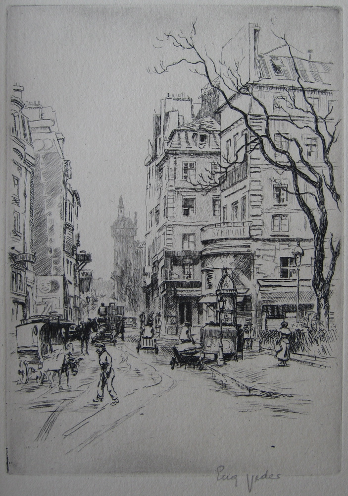
The enchanted Paris of Eugène Véder

I first came across the work of the etcher Eugène Véder in issue 17 of the art revue Byblis (Spring 1926), which published his etching La rue Saint-Denis. I thought it a lovely piece of work, and was intrigued to find out more about its creator - especially as my copy was hand-signed by the artist. I think Véder probably signed every copy of this print. Usually in Byblis there were 105 hand-signed and 500 unsigned impressions, but in this case there seem to have been 105 in colour and 500 in black-and-white, all signed.

Eugène Véder, La rue Saint-Denis
Etching, 1926

Byblis was published by the art publisher Albert Morancé. Morancé was evidently equally struck by Véder's work, because the Winter 1926 issue of Byblis carries a full-page advertisement for a work to appear the following June from Éditions Albert Morancé: Paris: 50 Eaux-Fortes originales en couleurs d'Eugène Véder, réunies en un portefeuille d'amateur. There were to be 100 copies on Japon impérial at a subscriber's price of 800 francs, 400 copies on vélin de Rives at a subscription price of 400 francs, and 25 hors commerce copies, 5 on Japon and 20 on Rives. On publication the prices were to rise to 1000 and 500 francs. I believe that 1000 francs then would be about 500 euros today.

Title page of Paris: 50 Eaux-fortes originales

I have managed to find a copy of this exceptionally rare work. It is one of the 20 hors commerce copies on B.F.K. Rives. It consists simply of 50 loose etchings with a title page and a contents page, in a paper cover. Remarkably, it still looks in brand-new, perfect condition, despite being now around 85 years old, and having been posted from France to the USA and back to England over the course of that time. It appears that it remained in Albert Morancé's personal possession until 1949, when he presented it to a young American friend, William Sutton. Sutton in turn sent it home as a Christmas gift to his family, with an excited letter in which he writes, "These 50 etchings in water color are priceless now because the artist is dead and this is the last collection (and the best) of his work. The editor, Monsieur Morancé, told me that every one is original and signed by the artist. Each etching expresses the quaintness found in every quarter of Paris. I have been to several of the places pictured and they are exactly like that."

Inscription from Albert Morancé on the verso of the half-title

In fact the etchings are signed in the plate, not hand-signed. Each one was printed by Eugène Véder himself on his own hand press - an incredible labour to achieve a total of 26,250 perfect prints, each painstakingly colour-registered. No wonder he didn't feel like signing them too!

Eugène Véder, La place du Parvis Notre-Dame
Etching, 1927

Eugène Véder, Sur le Pont-Neuf
Etching, 1927

It has been quite hard to find out all that much about Eugène Véder. Every website which lists or mentions him has his date of death wrong, repeating a rare mistake in the art reference bible, Bénézit. This has him living to be 100, and dying in 1976. As we know from William Sutton's letter, written on November 22, 1949, Véder was already dead by then. In fact he died in 1936.


Eugène Véder, La Seine au quai Saint-Michel
Etching, 1927

Eugène Véder, Le quai de Béthune
Etching, 1927


Perhaps not surprisingly, the only writing of any substance I have found about Véder is in Byblis, accompanying his etching of La rue Saint-Denis. It is an essay by Robert Vernand, entitled "Eugène Veder, Parisien" (Burnand never gives Véder the acute accent). He writes: Tous les jours, j'imagine, Veder quitte son atelier de la Montagne Saint-Geneviève, cette petite place de l'Estrapade qui, malgré son nom redoutable, dort à l'ombre de paisibles catalpas. Il s'en va, son carton sous les bras, ou sa boîte d'aquarelle. Il muse le nez en l'air, descend la rue Mouffetard, bavarde avec les commères, marchande des fruits aux baladeuses et, si besoin est, boit un verre sur le zinc. Et son oeil note et son crayon enregistre; il dessine et il peint dans un coin, installé vaille que vaille. "Every day, I guess, Véder leaves his studio in the Montagne Saint-Genevieve, in the little place de l'Estrapade which, despite its formidable name, sleeps in the shade of tranquil catalpa trees. He sorties out with his portfolio under his arms, or his box of watercolors. He dawdles, nose in the air, down the Rue Mouffetard, chats with the gossips, from the fruit sellers to the idlers, and, if necessary, pops in for a drink at the bar. And his eye notes and his pencil and records, and he paints in a corner, installed any old how."


Eugène Véder, La porte de Bagnolet
Etching, 1927

Eugène Véder, La place des Vosges
Etching, 1927


Burnand compares Véder's art to that of Jean-François Raffaëlli, the great Impressionist pioneer of the colour etching, and it is a comparison that also occurred to me. Interestingly, the earliest work by Véder mentioned by Bénézit is a 1913 drawing in coloured crayons entitled Les chiffoniers (The rag-and-bone men), a subject that also attracted Raffaëlli.

Jean-François Raffaëlli, Le chiffonier
Etching with aquatint, 1911


Eugène Véder, La rue Saint-Médard (Marché des Chiffoniers)
Etching, 1927


A second work mentioned by Bénézit places Eugène Véder at Arras in 1916; it is a crayon and watercolour drawing of Arras, porte des Trois Visages.


Eugène Véder, Le Marché aux Oiseaux
Etching, 1927

Eugène Véder, La place de la Madeleine (Marché aux Fleurs)
Etching, 1927


Eugène Louis Véder was born in Saint-Germain-en-Laye in 1876. As Bénézit attests, his artistic career stretches back before WWI, but I am not sure how active he was as an artist at this time - after all, he was 38 when the war broke out, so if he had been working as an artist much before that time, one would expect more evidence of it.


Eugène Véder, Le parc Monceau
Etching, 1927

Eugène Véder, La place Blanche
Etching, 1927


Whatever the facts, Eugène Véder is essentially an artist of the 1920s. He exhibited with the Salon des Artistes Français from 1922, becoming a member of the society, and receiving a bronze medal in 1923 and a silver in 1925.


Eugène Véder, Le Moulin de la Galette
Etching, 1927

Eugène Véder, La Pointe Saint--Eustache
Etching, 1927


Véder received prestigious commissions for etchings of Paris, for instance from the Chalcographie du Louvre, enabling him to establish himself in a studio in the place de l'Estrapade in the Latin Quarter. However his chief patron was certainly Albert Morancé, who promoted Véder's art in Byblis, and commissioned his masterwork, Paris: cinquante eaux-fortes en couleurs. These etchings remain one of the finest artistic records of the city of Paris. As Robert Burnand puts it, "With a few pencil strokes he evokes the clutter and bustle [of the city] - with a single line, he opens up infinite horizons."


Eugène Véder, Le Pont des Arts et l'Institut
Etching, 1927

Eugène Véder, La Tour Eiffel vue d'Auteuil
Etching, 1927


 Les Amis du vieux Châtillon published a book on Véder in 1993, Eugène Véder 1876-1936, but unfortunately I have not been able to track down a copy. Véder's son, Lucien Véder, was also an etcher. Taught by his father, he used the pseudonym Legarf so as not to tread on his father's toes.

Sunday, April 10, 2011

Edouard Daliphard - a lost Impressionist?

Édouard Daliphard is the opposite of a household name. Until I acquired the etching below, I had never heard of him - and actually it took quite a bit of concentrated research to find out who the artist was or anything about him. But now I feel quite passionately that Daliphard deserves new study and re-assessment. The classic lost Impressionist is Frédéric Bazille, who died in 1870 at the age of just 28. But Édouard Daliphard is another case in point. Daliphard was born in Rouen in 1833. He studied under Gustave Morin at the Beaux-Arts in Rouen, and then under Joseph Quinaux at the Brussels Academy. He exhibited at the Paris Salon from 1864-1875, and is best known for melancholy twilight landscapes of scenes in Belgium, Holland, and France. He died prematurely in 1877; I do not know the cause, but the fact that he failed to exhibit in 1876 suggests an illness rather than sudden death.

Édouard Daliphard, Etched signature

My etching by Daliphard is a street scene executed with an Impressionist spareness. It is the only etching by Édouard Daliphard that I have come across, and dates from the very end of his short life. It may be the only etching he ever made. It was commissioned from Daliphard by the Impressionist printmaker Henri Guérard for the short-lived journal Paris à l'Eau-Forte, which was published from 1873-1876. I have not yet been able to see a complete run of this journal, so I do not know if Daliphard's etching was published in the original run. Quite probably it did not appear until after Daliphard's death when - in 1879 or 1880 - the editor Richard Lesclide tried to revive the publication. My sense is that Lesclide was left with a lot of debts after the failure of Paris à l'Eau-Forte, When his own fortunes had revived, largely due to his employment as secretary to Victor Hugo, he had a go at reviving the journal. It seems he had a supply of etchings already printed by Delâtre for the original journal, and also a supply of copper plates, either previously published or commissioned but never published. Freshly-printed etchings were printed by Quantin, not Delâtre. The new version of Paris à l'Eau-Forte survived for two volumes, the second of which was renamed Eaux-fortes Parisiennes (though the dustwrapper still retained the old title). The economic desperation of this publication may be tested by comparison of two different copies. My first copy of Eaux-fortes Parisiennes has 26 etchings. My second copy, with exactly the same text, has only 17. Only 5 etchings are repeated, and not in any sort of rational order - for instance the frontispiece in the first copy, by Marc Antoine Claude Monnin, is repeated in the second, but opposite page 168. There are also several repeat etchings from my copy of the first volume of this ill-fated relaunch. There are no lists of the etchings, and in all 3 volumes there are some I cannot confidently attribute to a particular artist.

Édouard Daliphard, Street scene
Etching c.1876

Luckily, one of the etchings present in both my copies of Eaux-fortes Parisiennes is this deft work by Édouard Daliphard. The economy of line in this etching just takes my breath away. At a time when etching was all about filling the page with black, Daliphard holds back. His philosophy here is less-is-more - and he is right. It's perhaps hard now to realise how daring it was to leave so much detail out, and to simply suggest the subject rather than delineate it. Daliphard was influenced by Corot and the Barbizon School, and it seems likely that if he had lived he would have allied himself with the Impressionists. In 1875 Daliphard became a very early patron of Impressionism when he bought Berthe Morisot's La Lecture for 210 francs; the painting is now in the Cleveland Museum of Art.